Covering couples football stadiums all over the world

Showing posts with label World Cup. Show all posts
Friday, October 19, 2012

Top 5 Worst Tournament Mascots Ever

The 1966 World Cup is remembered for many things, from stroppy Argentinians being heckled by grannies to raising England's expectations to unrealistic levels for the best part of half a century. It is also a landmark tournament for one other reason.

World Cup Willy. The first ever FIFA endorsed marital aid... ha ha ha ha ha! But seriously, the first ever tournament mascot came into being, thus starting a tradition that has taken us from the very depths of corporate blandness to the edge of insanity.

I was initially going to concentrate on the World Cup and Euros, but after researching the Copa America, Africa CON and the Asia Cup, it's clear those tournaments are pure gold for strangeness!

Mascots are rarely well received, trying as they are to both appeal on a fun level while also trying to be culturally significant. The mostly negative reaction to Wenlock and Mandeville for the 2012 Olympics might explain why both England's mascots have taken the safer and rather predictable lion angle.

And so, I hereby present what I consider the five worst tournament mascots ever.

Guaso - Copa America 1991 (Chile)

The Official Line: ?

Seriously, that's all I could find by way of explanation. Apparently it's supposed to be some dude in a poncho and a hat. To me however it looks like the sort of thing you'd see sketched in a therapy session in a psychiatric ward full of serial killers... perversely, it would also be quite at home in a therapy session for the victim that got away.

"I tell ya, Doc. Every time I close my eyes I see him... clear as... ok not very clear... kind of blurry in fact. As if he'd been scribbled by a five-year-old child, but y'know... frightening and all that..."

Speaking of nightmares...

Pinoccio - Euro 1980 (Italy)

The Official Line: It's Pinoccio... what more do you need? Other than a good lawyer if Disney sees him!

This one may seem all very nice. Pinoccio, the little wooden boy. Lovely stuff. But wait... is it really so innocent?  Look at little Pinoccio there, all cute in his little paper hat. His paper hat. For the love of god, he's wearing a hat made of his own by-products! He's the Ed Gein of the mascot world.

Tell us Pinoccio, where's Gepetto? Asleep you say? Judging by his nose, that's clearly not true. And look at that smile and vacant stare. Now just picture that head turning ever so slowly towards you... that feeling? That's your blood running cold. Not long before it runs thick through his mahogany hands as that smile grows as fast his nose...

Agro-Hene - Africa Cup of Nations 2008 (Ghana)

The Official Line: Agro-Hene (King of the Game) the Eagle

There are a few explanations I can come up with for this one.

The CON organisers had just had Microsoft Word 1995 installed on their PCs and someone had found the clip art folder.

Someone posed the question "What would Nelson Mandela look like if he had an eagle's head, was playing football and had been drawn by a four-year-old?"

One point to note here... this was 2008. That's only four years ago. Was this really the best they could do? Mind you, if we're talking about not putting much effort in...

Rabbit - Euro 1992 (Sweden)

The Official Line: A football playing rabbit

Euro 88's mascot was called Berni and despite early suggestions he would be based on the then popular chain of steak restaurants, he was actually a footballing German grey rabbit... with a headband.

Four years later, Sweden, land of functional design, decided that the previous mascot was actually just fine and with typical minimalism, decided to change the bunny's shirt and... no, that was it.

The best part? His name was 'Rabbit'. Yes, from a land where even a shelf is called something elaborate like Ryksendokelporp, this thing got called Rabbit.

Just done some more research and it turns out, "Rabbit" is apparently Swedish for '3-door wardrobe with mirrored doors.'

Ato, Kaz & Nik - World Cup 2002 (Japan / South Korea)

The Official Line:  "Orange, purple and blue (respectively) futuristic, computer-generated creatures. Collectively members of a team of "Atmoball" (a fictional football-like sport), Ato is the coach while Kaz and Nik are players. The three individual names were selected from shortlists by users on the Internet and at McDonald's outlets in the host countries."

There are those who say crowd sourcing is the future, that it yields truly democratic answers, that one day it will replace search engines. To those people, I say this. If the answer that crowd sourcing gives you is 'Ato, Kaz and Nik', then you have asked the wrong fucking question.
You have read this article Africa Cup of Nations / Chile / Copa America / Euro / Ghana / Italy / Japan / Mascot / South Korea / Sweden / World Cup with the title World Cup. You can bookmark this page URL https://couplesfootballstadium.blogspot.com/2012/10/top-5-worst-tournament-mascots-ever.html. Thanks!
Wednesday, September 19, 2012

Chris O's Favourite 5... Football Tournament Logos

There’s nothing like a good logo to encapsulate the overwhelming excitement of a football tournament, so here’s my favourite five of all time...

1.  Argentina 78
I don’t know what it is that makes this so pleasing on the eye to me. Perhaps it’s those simple stripes in a shade of light blue so evocative of Argentina (OK, Uruguay too, if you must) or the way they curve sinuously around the ball like a pair of hands. Maybe it’s that clear depiction of the Adidas Telstar ball that had only been introduced eight years earlier but had already become a design classic. Or perhaps it’s the fact that the overall shape of the logo is unique and doesn’t really mean anything specific, added to the clear Helvetica-style font to add an air of friendly importance. All in all, I like it because it's enigmatic but somehow just looks right because all the component parts play their part perfectly.

2. Euro 88
It was only in 1984 that the classic UEFA Euro logo was introduced, but so versatile was it that it got recycled for Euro 92 and, in this case, Euro 88. For my money, this was the best of the three as the colours used look particularly good and sit perfectly with the whole ‘flag’ motif. I remember seeing this a lot during that tournament 24 years ago when England struggled so much, but the logo really stood out just as much as it does today with its lovely mix of curves and straight angles. In an attempt to stretch its credibility, someone somewhere at UEFA HQ created a whole range of these logos in the colours and years of all the previous Euro tournaments, but I can’t say I approve. This logo was special because of its limited shelf life, and that’s all that matters.

3. USA 94
It goes without saying that when you design a football tournament logo, it should contain a football symbol somewhere within it, even if my second choice above goes against that rule of thought. The key is what you do with it, and the 1994 World Cup showed that it’s possible to be creative without showing off. With the competition being held in the US, the ball in this logo effectively took the place of the stars in the Stars and Stripes. Using some extra blue lines to convey movement over and above the red and white of the flag, this logo ticked all the boxes for style, simplicity and ability to convey a message. The finishing touch was to display the title of the tournament in a Swiss font using a combination of styles and colours, but essentially that was it. Crisp, clear, unambiguous graphics. Nice.

4. Euro 2012
Anyone that owned a Panini Europa 80 sticker album will remember the competition’s logo – a stylised flower based around a football motif (told you). It was this logo which proved the inspiration for the Euro 2012 tournament, designed by agency Brandia Central, that brought the flower idea up right up to date in a more colourful and slightly 3D way. The design itself is gorgeous with a football for the main bloom of the flower, yet it and the petals all use human figure devices with outstretched arms as part of the understated styling throughout. The colours of the host nations, Poland and Ukraine, feature noticeably but tastefully and the font is modern but informal. Rather cleverly, the floral design could be applied to a variety of different uses from umbrellas to posters and on its standard purple background rarely looked anything other than absolutely superb.

5. Italia 90
I do like it when something is designed in a way that’s simple but clever. That’s what you get with the Italia 90 logo which is fundamentally an old fashioned football symbol with a coloured shadow. The colours, of course, are carefully chosen – the red and green from the Italian flag – in order to stand out from a clean white background. Nothing else is needed because it works entirely well on its own. There’s also, however, the very distinctive font which is in a stencil style tilted back in perspective below the ball. Once again, a stroke of genius and one that completes the subtle, chic look that for all we know could have been created by one of Milan’s finest design agencies.

Got a Favourite 5 of your own that you want to tell us about?  Drop us a line at admin [at] thefootballattic [dot] com...
You have read this article Argentina 78 / Design / Euro 2012 / Euro 88 / Euros / Italia 90 / Logos / USA 94 / World Cup with the title World Cup. You can bookmark this page URL https://couplesfootballstadium.blogspot.com/2012/09/chris-o-favourite-5-football-tournament.html. Thanks!
Tuesday, September 18, 2012

The Golden Age of World Cup Advertising Boards

Way back in 2007 while working on my first football blogsite, Some People Are On The Pitch, I created a weekly feature called ‘The Friday List of Little or No Consequence.’ It took the form of a trivia list featuring silly and irrelevant facts on a given subject you wouldn’t find in an ordinary football reference book. In order to get the Friday List off and running, I started with a list of 11 names that used to be seen on pitchside advertising boards in the late-1970’s, and therein the rather daft tone was set for the 200 or more lists that followed.

As it is, that first Friday List was probably an inspired choice because the humble advertising board, despite being largely overlooked and taken for granted over the years, has actually become an evocative way of dating the football we see on our TV screens. 


Nowadays, of course, the boards themselves have often become replaced with computer displays capable of not only changing the brand being advertised but animating it too – sometimes to annoying effect. 

It wasn’t always thus and to prove a point, we take you back to a time when ‘corporate partner’ usually meant the bloke outside the ground selling official programmes, and 'targeted advertising' meant wearing a tracksuit with the name of a local central heating supplier on the back.

World Cup '66: Jets and gin
Though the World Cup is today synonymous with corporate giants like Budweiser, McDonalds and Playstation, it’s refreshing to see that things were altogether different not so long ago. It was only when the 1966 World Cup came around that we saw pitchside advertising on any kind of noticeable scale and even then it was purely at the jurisdiction of the ground where the matches were played. While Wembley retained its magisterial purity by avoiding the use of perimeter boards throughout, other stadia like Old Trafford and Hillsborough embraced the chance to earn a few bob in the side with great gusto.

And what fine companies we saw back then on those grainy black-and-white TV pictures. Brylcreem and Gordon’s Gin were writ large at many grounds during the 1966 tournament, conjuring up an era of style and quiet sophistication, as did Zeiss of Jena, makers of fine watches and timepieces who can’t have made many sales through the clientele of Manchester and Sheffield. During the Portugal v Hungary match, however, we see further evidence of an aspirational age – BOAC VC10 signalling the arrival of air travel for the masses and the perfect place on which to knock back a glass or two of Haig Scotch whiskey.

Up at Ayresome Park, however, the board advertising Newcastle Brown Ale showed there was one part of Britain still keeping a firm grip on its priorities although other grounds were happy to promote the likes of The Sun and the Anglers Mail as the reading material of choice for the ordinary man on the street.

The 1966 World Cup was the first to see live TV pictures being beamed around the planet via satellite and with it came the first real chance to generate revenue through a truly international range of companies. Names like Dortmunder Union can be seen cropping up in one or two places, but it was in 1970 that the practice became properly commonplace.

World Cup '70: Anytime, anyplace, any... frozen fish?
There in the baking sun of Mexico were ads for Verpoorten advocaat and Sinalco cola, but they were still fighting for attention alongside the Martinis and Cinzanoes of this world.

Strangely enough, you could have often been mistaken for thinking the 1970 World Cup had actually been held in England given the pitchside boards on display. Names like Daily Mirror, Lipton’s Tea and even that of John Stephen, Carnaby Street fashion designer, were often  seen.

World Cup '70: Papers and  Petrol
Let’s not forget, however, that this was also the year when Esso had their most successful marketing campaign with their World Cup Coin Collection, and they too must have gained greatly from having such huge exposure during Mexico ‘70. Hell, even Mothercare and NatWest were getting in on the act during the England v Brazil match.

World Cup '74: Fizz 'n' mints
Four years later in West Germany, things got more random and more standardised in equal measure. Virtually every match seemed to have advertising boards for Dry Sack sherry, Tic Tac mints and Rollei Foto (a German camera manufacturer) alongside the usual old favourites like Phillips and Martini, but at the other end of the scale things started to get very random.

The matches involving Scotland threw up some particularly splendid combinations the like of which haven’t been seen before or since. Against Brazil it’s possible to spot advertising boards for Chessington Zoo, Woolworth and Sinclair Calculators as well as Skol lager and Alka Seltzer (arguably a match made in heaven).

World Cup '74: Zaire and the Zoo
In the 2-0 win over Zaire in Dortmund, one board urges us to ‘Go to Zaire’ while another elsewhere in the ground proclaims ‘Let’s go British Caledonian’. Had the latter flown to Kinshasa, it might have been possible to do both at the same time, we can only presume.

The 1978 World Cup was the last time we saw any kind of irregularity in the names appearing on pitchside advertising boards, but once again we had a mixture of old familiar brands mixed up with those targeted at a more local level.

Daily Mirror was there, appearing at their third and last World Cup, and also returning to the fold were the likes of Coca-Cola, Smirnoff and the old UK favourite, Visionhire. Much visibility was given to Cafe Do Brasil and Fernet Branca, this being a South American World Cup, but some oddities were thrown up when specific countries entered the field of play. Tungsram (a Hungarian light bulb manufacturer) and Iran Air had advertising boards of their own but the Scots weren’t left out either. With predictable stereotyping, they could at least take comfort in the pitchside advertising boards for McEwans Lager, Mackinlays Whisky and Old Parr Scotch Whisky.

World Cup '78: Bubble Yum and Iran Air
On the cheesier side of things, Argentina ’78 threw up some splendid examples of ‘it couldn’t happen today’ nostalgia. Bubble Yum made an appearance during the Scotland v Iran match while home-builders Wimpey showed up during the Tartan Army’s game against Peru. There was even some exposure for the grand daddy of them all, Mornflake Oats, during the Poland v Mexico match.

And so it was that in 1982 we entered the world of ‘official partners’ like JVC, Canon and Gillette, although we were still a short distance from having blanket coverage by the worldwide companies we know today. Winston cigarettes were a surprise choice in Spain, as was Sport Billy, an American cartoon series that was adopted by FIFA to promote health and fitness in the young that had originally appeared on advertising boards during the 1978 World Cup.

Essentially, however, that was it. No more would brands like C&A and Weetabix decorate a World Cup pitch and with it we lost the innocence that football once had. Where was the harm in confusing foreign audiences with advertising boards for Ferguson TVs and Rizla cigarette papers? The answer: there was none, for back then the world was a different place and in our view, no worse off for it either.
You have read this article Advertising boards / World Cup with the title World Cup. You can bookmark this page URL https://couplesfootballstadium.blogspot.com/2012/09/the-golden-age-of-world-cup-advertising.html. Thanks!
Friday, September 7, 2012

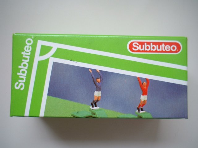
Rich J's 5 Worst Subbuteo Items

At the recent Socrates meet up, an interesting discussion arose, inspired by our original five top Subbuteo articles (here and here). What were the worst five?

There was an almost unanimous verdict that the worst of the lot was number one on this list, but what would the other four be? Subbuteo produced a raft of accessories so it should be pretty easy to find five terrible ones surely? Well, not as easy as you'd think.

Using the wealth of info on the Peter Upton site, I trawled through them all and if I'm honest, I was hard pushed to complete a top five! While a lot of accessories were superfluous (the police set or 'players warming up' for example), at least they added to the atmosphere and they were only ever intended as diorama figures, so here I'm concentrating on things which seemed to either serve no purpose whatsoever or were just bad at what they were designed to do.

So...here are my five worst Subbuteo items.

1. Throw in takers (C132)

Ping... OUCH!
Anyone that ever used these will know just how crap they were. On the surface, they look quite good... nicely sprung base, outstretched hands; should work like a dream! Oh no, for unless you had at least three hands or perhaps some kind of Wallace & Grommit system of pullies and levers, you were screwed.

The fundamental problem was the entire design. Let's just run through how one had to use it and then detail why it was so bad.

Hold ball in front of throw in taker, press the springy bit back and release. Simple, yes? No. Holding the ball was the easy part, but getting it to spring was where you needed the extra limb. The base wasn't heavy enough to either hold the thing steady or to cope with Newton's 3rd Law of Motion. With one hand you had to hold the base to make sure he didn't ping into your eye while the ball hovered awkwardly in space like the shy kid at the school dance... in space. You then had to bend the thrower part back and release it, ideally as smoothly as possible. The issue here was the part you had to grip wasn't very big so obtaining any sort of purchase usually involved fingernails and I dread to think how many expletives were uttered when said fingernail was bent backwards (lots in my case).

Of course, all this may be purely down to my own inabilities, but even then, once you mastered it, the ball's direction was still subject to a great deal of chance, what with the ball being grossly out of scale to the hands doing the throwing.

Surely a few minor tweaks could have improved this? A larger flicking area and maybe a cup shape to hold the ball in place so one hand could hold him down while the other flicked to throw? But, no...that would have looked stupid and detracted from the realism... a bit like having a giant suddenly appear on the pitch to take a corner... oh wait.

2. Throwing / Kicking Goalkeepers (C202/3) & Pack of Assorted Goalkeepers (61211) 

WHY???
I never owned these and the simple reason for this is they are absolutely bloody pointless! I concede you could use them for taking goal kicks, rather than using an outfield player... and maybe the throwing figure for throwing the ball out, but there was already an accessory to do both of these jobs in the form of the corner kick taker! There had also previously been available 'spare' goalkeepers, which were just normal players painted to look like keepers for the aforementioned tasks. Added to this was the slight problem of the figures not actually being properly balanced so your goal kicks were being taken by the equivalent of Bruce Grobelaar in permanent 'wobbly leg' mode.
Hatred on a stick

Still, at least these were on proper player bases and not the usual goalie sticks... no, hang on - they existed as well. Someone please explain to me what the point of a goalie holding the ball is when he's trying to save it? Mind you, at least he's doing something unlike the dude with his arms down! What's he? 'Pre-kick off goalie'? Why not just go the whole hog and have 'Driving home after the match goalie on a stick' or 'Sit down protest Neville Southall goalie on a stick'? I loved you Subbuteo, but you really did test me at times!

3. Spring Goalies (61123)

BOING...GOAL!
While on the subject of goalie accessories, these fell squarely into the category of 'looks like a genuine improvement - utterly useless in reality'.

What should have delivered extra excitement as your keeper 'sprang' into action, making dramatic diving saves left, right and... well, not centre... in actuality delivered a keeper whose sole source of strength (his stiff rod... settle down at the back there!) was swapped for something rather floppy and useless (Right, detention you two!)

To actually get him to utilise the extra spring in his step, you'd have to almost slam him towards the post, which made for less than precise saving action. On the flipside, any decent shot would see him bend over backwards to let the ball in the net. If only there was some way of not having to see such dismal displays... ah, let's use the...

4. Floodlights (C101)

LIES!
Ah, the thrill of owning the floodlights! Our younger readers (do we have any?) may need to Google 'floodlights', robbed these days of the chance of seeing the four-shadowed figures ghost across the park in the winter gloom.

Us older people will remember them and the excitement of owning a set to host your own evening kick-offs in Subbuteo world. These were one of the most expensive accessories you could get and as there were only two in the box, most of us held our first match with just half of the pitch illuminated.

The tension builds as one removes them from the box, inserts the 4 D-size batteries and finally switches them on. How glorious they look! Now for that true touch of authenticity, one switches off the living room light... Hello? Where did everyone go?  Why is there something with less power than a candle creating a tiny pool of orange in the near distance?

'Floodlights' was an over optimistic description. 'Damp squib' would be more appropriate. You were then faced with two options. Play the match in darkness a mole would struggle with or flick the light back on and accept that Subbuteo hated you and your whole family.

5. Subbuteo World Cup (C157)

Whatever...
No, not the Jules Rimet Trophy or the C182 World Cup Trophy, but the "Subbuteo World Cup".

I own this and the only reason I can give you for why is that it's pretty rare. That's about it. It's ugly and utterly meaningless. I had assumed it was a replica of the trophy presented to the winners of the Subbuteo World Cup tournaments, but apparently not.

The best reason for its existence, as detailed on the Peter Upton site seems to be that:

"Charles Stadden had produced Subbuteo's version of the Jules Rimet, but I have been told that he did not like the design of the new trophy, and refused to copy it. Perhaps this was the result. Whatever the reasons, this trophy was replaced by an official copy of the new FIFA World Cup (C182) in 1981"

So they're mine... what are your worst five?
You have read this article Subbuteo / World Cup with the title World Cup. You can bookmark this page URL https://couplesfootballstadium.blogspot.com/2012/09/rich-j-5-worst-subbuteo-items.html. Thanks!
Thursday, August 23, 2012

Arctic Software's World Cup (C16 & Plus/4)

THIS is the game I talked about in the podcast! Turns out it was the game that US Gold utilised for World Cup Carnival, which Chris mentioned (and the fantastic 200% article he mentioned is here).

The C64 version doesn't seem to be too bad, but this is what I had to put up with...


Football computer games...screw you!
You have read this article Arctic Software / Computer Games / US Gold / World Cup with the title World Cup. You can bookmark this page URL https://couplesfootballstadium.blogspot.com/2012/08/arctic-software-world-cup-c16-plus4.html. Thanks!
Tuesday, August 21, 2012

Ed Carter's Top 5... World Cup Shirts

The kits keep on coming as today we welcome Ed Carter's choice of his favourite five World Cup shirts...

1. West Germany (1970, home)

(West) Germany have a virtually unblemished record of brilliant, tasteful football kits. Even when they went completely insane (1990 and 1994) they did so with such panache and style that it was brilliant and the world and Jeff Banks rejoiced. However, for me it's always the plainer the better and the 1970 West German kit is perhaps the most beautiful ever seen in the World Cup finals. Two-tone with simple collar and cuff trim and a brilliant black German eagle badge in a thick black circle. Dutch people would go to their child's wedding wearing this kit.


2. Peru (1982, home)

No top five World Cup kits would be complete without a Peru entry. This is because sashes are the best and Peru therefore has the best international football kit. My favourite of the four Peruvian World Cup efforts is their most recent one. It dispenses with the flappy collar and has a v-neck instead. New York dockers everywhere rejoiced. Finally they could support Peru whilst on shift. Also, for anyone who reckons a good kit can make your team play better: 1982 represents Peru's most disappointing World Cup finals performance to date.

3. Portugal (1966, home)

I'm a terrible old purist when it comes to football kit design. The simpler and plainer the better. The 1966 and 1970 World Cups were the golden age for this sort of thing: earlier than that and everyone was still wearing home-knits and boots that would get you bullied by Billy Dane; after it and it was all corporate branding and lousy "design" bits. The Portuguese kit is one of my favourite ones of the bunch. I particularly like it for the deepness of the red and the green trim on the shirt's contrast with the white shorts. Portugal memorably made it all the way to the semi-final wearing this outfit, giving important evidence for anyone who reckons a good kit can make your team play better (it can't).

4. France (1986, away)

Another from the Adidas '86 stockpile of brilliant things. I love this one for the uniquely patriotic take on the Adidas corporate stripes - one in red and two in blue, c'est magnifique - but especially for the trim. The audacious brilliance of the thing. Who the hell ever thought this up? The thicker horizontal stripe in red is delicious enough, but to follow it up with three more thin ones in blue? It's a very special moment in the history of kit design. The only way you could improve it? An oversized yellow cockerel emblem. But wait, there's one right there!

5. Soviet Union (1986, away)

I am a complete sucker for international football kits with stuff written on them. I'm too young to remember a world before shirt sponsorship, television and Alan Hansen ruined football forever, so the international football shirt's lack of verbal signifiers seems daring in the extreme. However, just as a club team pitching up without a shirt sponsor on their jersey remains a rare treat, so does an international team showing up with monikers emblazoned on their chest. Algeria's 1982 effort is a particular favourite, written in Arabic script for extra bonus points. Brazil have a splendid tradition of writing BRASIL on the front of their goalkeeper's jerseys - presumably so that the team can remember at a glance which way they are attacking. But let's face it, the great masters of this are the old CCCP. Just typing those letters give me a giddy thrill. It was a simpler time, the cold war. Ah, the nostalgia.

The 1986 variant is my favourite one. Adidas' kit templates for the Mexico 86 tournament were a design classic worthy of any museum and this is one of my favourite of the bunch. And only in Gorbachev's Soviet Union would the national team wear such an extravagantly decorated kit, with a shiny shadow pattern woven into the otherwise clean and plain white kit. It's an outfit that says, "we admit we killed the Tsar but we're not giving up our nukes just yet".

Our thanks to Ed for his superb selections. If you want to follow Ed on Twitter, check out @Dotmund or visit his blogsite here
You have read this article Adidas / Favourite 5 / France / Kits / Peru / Portugal / Shirts / Soviet Union / West Germany / World Cup with the title World Cup. You can bookmark this page URL https://couplesfootballstadium.blogspot.com/2012/08/ed-carter-top-5-world-cup-shirts.html. Thanks!
Monday, August 20, 2012

Al Gordon's Top 5... World Cup Shirts

Al Gordon from God, Charlton & Punk Rock is the latest fellow blogger to give us his Top 5 World Cup Kits:

1. England (1982 Away)

Once upon a time Admiral set the standard in kit design.  This Leicester based firm had the best logo, the best templates and the best of the clients, England.
Many think the home kit of this era to be the greatest England shirt of all time, yet it is the red away version that I always fondly remember. A quarter past five on the 16th June 1982 we kicked off our World Cup campaign against Platini and the French. A Bryan Robson goal just a minute later and we all really thought it could be ‘This time’ after the disappointment of missing Argentina in 78. It’s interesting to note that both sides wore their away strips although the home ones didn’t clash.

Worn for this match with white shorts and socks, it really suited Paul Mariner with the shirt doing its best to hide the shorts, complementing his wonderful head of hair. As an eleven year old boy, I thought he really looked sharp. Coolness personified. Yet the exact same articles of clothing did nothing for Mick Mills. Some players just need a large flappy collar! It would go on to get another outing in the second round against West Germany although this time with the correct red socks.
This was to be Ron Greenwood’s last hurrah as England boss and we went home without being beaten. It was a great squad of players, perhaps never bettered? The kit certainly hasn’t been.


2. Zaire (1974 Home)

The 1970’s threw up some rather ‘way out’ clothes from platform boots to kipper ties. In between these were ‘hip’ t-shirts with a wide range of novelty slogans. Zaire bought a box load of one particular design.
Green and yellow are the traditional colours for Africa, Leopards are native animals there. Some things are just meant to be. What that country needed was a football shirt that would fulfil a purpose after the side were knocked out and could be worn back home with a pair of flared jeans and an afro.
Adidas got it bang on I’d say. The picture on the front was bigger than most modern day sponsors logos and has inspired a generation of real t-shirt copies ever since.
They reversed the colours for the second strip although this lost the collar and with it some of its charm becoming a simple V-neck.
Then of course there’s that Brazil free kick which guarantee’s this kit will always be seen and loved by generations to come.


3. Scotland (1986 Home)

Although worn in Mexico for a disappointing showing in the World Cup finals, this kit is more remembered for a sad night in Wales which saw Scotland claim a play-off spot against Australia.
Jock Stein was the manager that night but suffered a fatal heart attack due to the stress caused by the whole affair. His assistant at the time was a certain Alex Ferguson, then manager of Aberdeen. Ferguson stepped up to the mark and led his country to Mexico.
A traditional blue number from Umbro, the shirt was striped horizontally in two different tones, yet it was the shorts which always stick out in people’s minds.  A big bold horizontal stripe ran through the middle of them! Other than this band, the kit was very conservative with standard Umbro collar and very plain socks.
It was this under stated but smart look that made the blue stripe on the shorts seem even more shocking and appealing.
Defeats to Denmark and West Germany both by the odd goal and a goalless draw with Uruguay saw the brave scots go home early.
It was also a brave attempt by Umbro as the competition was hotting up, especially from Denmark and the superb creations from hummel.


4. Belgium (1982 Home)

Braces, need I say any more? Admiral’s greatest template idea which had the most important of features,  a design that continued from the shirt to the shorts.
These weren’t just striped braces but ones that had small admiral logos running down the length of them in a similar fashion to the stripes on the Tottenham and Leicester kits a few years previously.
Belgium started the tournament with a win over holders Argentina and wore white shorts with their red shirts and socks.  The yellow braces on the white shorts looked a little harder to interpret yet maybe due to the quality of the opponents have become a little iconic. Well in my eyes anyway.
With the likes of Gerets, Ceulemans and West Ham’s Van Der Elst, this was one of the greatest Belgian sides ever to be assembled. They however struggled to make an impression after beating the holders gaining a 1-0 victory over the very inexperienced El Salvador and only managing to draw with Hungary.
That first game was enough to see them win the group and go on to face Poland and the Soviet Union in phase two. Belgium struggled to make an impact and went out quietly. After the European Championships two years previously where they had reached the final this was a bitter disappointment.
Once again the kit is fondly remembered for its design rather than the performances whilst wearing it.


5. Peru (1978 Home)

Number five was going to be Cruyff, the big badge and the two stripes. At the last moment though I’ve gone for another side with a big badge and a wonderfully simple shirt, Peru. I do like big badges.
Wins against Scotland and Iran plus a very commendable draw against the Dutch blur into the memory compared to events that would occur in the second round.
That defeat to Argentina is one of the most controversial moments in World cup history, if they were playing Olympic badminton they would without doubt have been thrown out of the competition.
The politics behind it all are no way near as simple as the kit. A plain white shirt with a large red sash diagonally adorning it has become synonymous with Peru, but 1978 saw it in one of its simplest forms.
A colour way not unfamiliar to those in Argentina, River Plate wear the same design, this had a large Peru badge which was just as simple as the shirt itself. Two red stripes either side of a white one with the letters F.P.F. above them.
I recently saw a picture of Peru in the 1936 Olympics and the design, even down to the badge, was the same.
Over the years Umbro and Adidas amongst others have produced this kit, yet never deviating from what must be a very strict brief. It’s so good Peru have become far and away my favourite South American footballing nation just on the basis of it.
I’m even partial to the odd can of Red Stripe when they’re playing.
You have read this article Belgium / England / Kits / Peru / Scotland / Shirts / World Cup / Zaire with the title World Cup. You can bookmark this page URL https://couplesfootballstadium.blogspot.com/2012/08/al-gordon-top-5-world-cup-shirts.html. Thanks!
Wednesday, August 15, 2012

Rich Nelson's Top 5... World Cup Shirts

Rich Nelson from Nelson's Column and Escape To Suomi has kindly sent us his Top 5 World Cup shirts...

France (1986, Home)

A more refined version of the Euro 84 effort, yet to be replicated (unlike 1998’s copy of '84). The perfect shade of blue, matching with the shorts and socks to complete the Tricolore. Unfortunately this was the beginning of the end of the great French team, along with some really dreadful threads.


Zaire (1974, Home)

Worn in West Germany in 1974, this announced Zaire on the world stage. While they have become a parody as a result of THAT free kick, this shirt was simple yet different. The fact that the picture of the Leopard needed a caption is such a humble, understated notion. Plus that free kick was hilarious.


West Germany (1990, Away)

While it feels wrong to appreciate the battle garments of certain rivals (Argentina, Scotland, Germany), this one belongs in the history books. Taking the classic late '80s Adidas template and running with it, it also made light green work - so much so that an Adidas re-release this year sold out within days (according to a reputable online store). Let’s just forget the penalties…


Cameroon (1990, Home)

Beating the world champions in the San Siro is the stuff of dreams. Wearing what looks like a hand-me-down, they made it work by adding an indomitable lion and a striker of questionable age and gyrating hips. The shirt’s oversized crest worked. Future attempts by Puma to remove sleeves and add rips down the sides just took it too far.


Holland (1974, Home)

The premiere of Total Football on the world stage, and subject of a petty contractual dispute. Another shirt to spawn retro knock-offs, it was a simple design to allow the football to do the talking... except for Johan Cruyff and his contract with Puma, leading to him removing a stripe from each sleeve. Great colouring, and a reminder of the tempremental Dutch we all love to hate.

You have read this article Adidas / Cameroon / France / Holland / Kits / Shirts / West Germany / World Cup / Zaire with the title World Cup. You can bookmark this page URL https://couplesfootballstadium.blogspot.com/2012/08/rich-nelson-top-5-world-cup-shirts.html. Thanks!

Rich J's Favourite 5... World Cup Shirts

Following on from Chris' Top 5 World Cup Shirts, I present my choices. Just missing out were Denmark '86 (Home) as Chris had chosen the away so I thought I'd find an alternative and West Germany 1990 (Away). A great shirt from a classic design, but just didn't quite make the cut... so, here they are:

1. Argentina (1986, Home)

It’s obvious Mexico 86 would rear its (none too) ugly head with anything I do, but this kit has been more than just a shirt to me - it’s been a lifelong quest. In the same way I spent most of my youth and adulthood trying to track down a Subbuteo World Cup Trophy, a parallel quest was to own this, or more likely, a replica of this shirt – a quest that has mostly been achieved.

There are several things about this shirt that set it above all other Argentina outfits. The centre stripe is white... big deal you say, but Argentina always have the centre stripe blue (I am deliberately ignoring Adidas’ shameless attempt to ape this iconic design at the 2010 World Cup). Big deal, I hear you repeat, but that’s me - I like the small details of these things.


Secondly, the shirt was made in that tea-bag material so common at the time and reminiscent of the airtex shirts worn by England in 1970, both times brought about by the stifling Mexican heat and the need to play games at midday for European TV audiences.
Last, but not least, it just looked so good in the blazing sunshine, with the contrasting black shorts and white socks... a fine ensemble.

As a final point: I nearly went for the change shirt worn against England, which could almost be referred to as a 3rd shirt, given it was a one off, but the home shirt just edged it as it made the final look so colourful with West Germany in their green away shirts.

2. Italy (2006, Home)

I’ll say it here and now: despite blue being my favourite colour, I have just never liked Italy shirts. Not quite sure why, but they’ve just never done it for me. That all changed however, in 2006. The gorgeous blue, contrasting with the dark side panels just seemed to really work. Add in the gold numbering / logos and that was it... SOLD! And sold it was as it was the first ‘new’ football kit I’d bought for years (I’d been buying mostly older ones off eBay until then) and one which sparked an avalanche of kit buying.

One huge downside of this shirt was that, when worn in matches, because of the design which was supposed to wick sweat away from the players, within seconds of the match starting, the players all looked like they were in a wet t-shirt contest...only one where they were doused with sweat...men’s sweat. Grim.

Italy went on to have another great shirt combining blue and gold at Euro 2008, a fascinating light blue one with brown shirts at the 2009 Confederations Cup, then ruined it with the robot face abomination at WC2010. Their Euro 2012 shirt was also rubbish. So there.

3. Argentina (1998, Away)

Though this is one of my favourite kits of all time, I was originally going to go for the Yugoslavia home kit from the same world cup as it’s in the same style and I was trying to avoid two kits from the same country, but when I saw this one again, I just had to choose it.

Again it’s the details I like with this one. Argentina have long worn blue away shirts and these have mostly been in a dark shade, which can often lead to them being rather drab looking with some bordering on black. This one however is lightened by its two key features:

1) A classic v-neck. For me, there’s no better neck on a shirt than a good old V. Crossover V’s are good, but just a classic, joined in the middle is better and this one sets off the dark blue of the shirt perfectly, finished in sky blue with white trim.

2) The side panels. White side panels with two sky blue stripes (oh wait, it’s an Adidas shirt so that’s basically light blue side panels with three white stripes) running from the base of the shirt to the sleeves.

This was worn of course, in the match against England in which two stars effectively showed two different career paths with Owen shining brightly only to fade away and Beckham going from effigy No.1 to all time great (and then fading out as well). Oh, and Ian Wright sulked on national TV afterwards...

4. Ireland (1994, Away)


One cannot see this shirt without also picturing a furious John Aldridge threatening to take on the whole of the USA if he wasn’t allowed on that ‘damn’ pitch, Jackie Charlton having handbags with the 4th official alongside him. The shirt itself was a masterpiece in away design in that it retained the usual colour scheme of the away shirt, thereby not straying too far from tradition, but did something interesting with them instead. Three stripes (on an Adidas shirt???) in green with orange pinstripe borders that faded out halfway down the shirt.

I’m sure this will be a controversial choice, but may I also remind you that this was a World Cup when approximately 97.3% of the teams present had the same identikit Adidas design with the three truncated stripes rising diagonally from either side of the kit, so to see something with a touch of originality was rather refreshing.

5. Brazil (1986, Home)

Brazil’s kits never really used to change, did they, save for a slightly different collar. Nowadays, there’s all manner of crap invading what is essentially an all time classic shirt, the low points of this being Umbro’s 94 shirt with large shadow pattern badges across the thing and 2002’s craptacular Nike effort with thin triangles of green forming some kind of frame... ugh!

But back in 1986, there were still all about the classic look. Made by Topper it was, as stated, a simple affair. Plain yellow, no shadow patterns, no flashes of green, just plain yellow. Dark green cuffs and matching collar, but not a round one like '70 and '82, a v-neck with collar flaps.

Finishing this all off nicely was their badge, which had replaced the usual CBF crest with one featuring the Jules Rimet Trophy, celebrating the three World Cup wins. Showcased in the quarter final against France, one of the best matches at a World Cup Finals, this shirt is a true classic. Also, Socrates wore it and he was a dude!

You have read this article Adidas / Argentina / Brazil / Ireland / Italy / Puma / Topper / Umbro / World Cup with the title World Cup. You can bookmark this page URL https://couplesfootballstadium.blogspot.com/2012/08/rich-j-favourite-5-world-cup-shirts.html. Thanks!
Tuesday, July 24, 2012

Random Things From Our Football Collections: Pique

Awww, look at little Pique there, a microcosm of all Mexican stereotypes all rolled into one cute (?) little mascotty thing.

Aye Caramba etc

Let's just tick all the boxes shall we?

Sombrero - check
Pencil thin moustache... or is it a beard? - check
Two tone green skin - er...

There are rumours that he was even available in a little gift set, replete with mini wire cutters, false documents and years of second class citizen status, but that may have just been made up... by me... just now...

Ironically, the story of how this little fella came to be in my collection does indeed involve clashes with authority and border crossings.

Let me take you back to 1986 (again). I'm in my first term at secondary school and, as was customary at the time, us first years get the chance of a day trip to France. I believe these trips were known amongst the teachers as 'booze cruises', whereas for the kids, it represented the chance to buy all manner of contraband.

The day before we're due to leave for foreign shores, we're informed that our destination has changed. Far from the Gallic adventure we'd anticipated, we were instead bound for Belgium. To this day I have no idea why this last minute change took place; the only possible explanation must be that one of the teachers was a huge fan of Enzo Scifo...

As with any winter cross channel journey, the weather was horrendous and the decks were awash with salty brine and juvenile lunch in equal measure. We survived, however, and at 8am the following morn we docked in Bruges. On reflection, we technically didn't cross any borders... just sort of sailed into them.

'Twas a misty morn and as we boarded the coach to take us to the delights of the local hypermarket (because that's what you do the first time you set foot outside of your home country, go to a Tesco Extra), the heavens opened... a sign of things to come? Or just a cold front moving in from the east?

Finally, we arrived at the hypermarket and what a huge place it was too... full of... well, the same sort of stuff you could get over in Blighty, really, just with funny packaging and strange prices (remember Francs anyone?)  I made a sweep of the place and while my friends were busy hoovering up all the bangers they could find, I was occupied trying, with my limited resources, to find presents for my family. If you've ever tried to find souvenirs in your local supermarket, you'll perhaps empathise with my predicament and understand why my relatives ended up with mostly stationery-based gifts.

Having made my purchases, I was then wandering round the shop trying to find my friends when my eyes fell upon Pique. His little sucker attachment indicated he was clearly designed as a car ornament, but, being 11, I possessed no such mode of transport. That was not going to deter me from owning a rather ropey piece of Mexico 86 and so back to the checkout I headed.

Upon arrival at the checkout, the woman behind the desk eyed me with xenophobic suspicion, though it could have been mainly because I was with a group of schoolchildren who seemed to be trying to fill their pockets gratis at every opportunity. It probably was that. After I had completed the financial transaction involving my little mascot friend, she (the checkout woman, not Pique, who was, after all, clearly a male chilli) pointed at the bag containing my earlier purchases and demanded I show her proof that I had paid for them... or at least I assume that's what she said. She wasn't speaking English... how very insular!  I searched frantically for my receipts, but to no avail. What had I done with them? I'd only purchased them a few minutes previous.

She handed the bag to what I assume was a manager who looked at the contents and probably decided that any 11-year-old prepared to 'steal' some notebooks and a few pencils probably wasn't worth dealing with, so he handed me back the bag and ordered me from the shop.

The ferry journey back may have been fun for my friends as they hurled their bangers at every possible surface and watched as one of our number sleep-walked into the decks below and tried to get into someone's cabin, but for me, it was a journey of shame for I had been branded (incorrectly, remember) a criminal. I would forever be known as The Pencil Thief and my slow descent into full on criminality was as  inevitable as it was imaginary.

But still... Pique!
You have read this article Mascot / Mexico 86 / Pique / World Cup with the title World Cup. You can bookmark this page URL https://couplesfootballstadium.blogspot.com/2012/07/random-things-from-our-football.html. Thanks!
Tuesday, May 29, 2012

Classic Kits - League of Blogs Style

Holland 88, Denmark 86, Coventry City's Brown Away kit (cough)... Classics all of them.

The one that intrigued me most yesterday as my mind wandered far from what it should have been concentrating on was Holland 88...mainly as this simple question occurred to me:

Did Subbuteo ever produce this kit?

From what I recall, Holland only ever had the plain orange shirt in Subbuteo form and it'd be one hell of a complex kit to produce at such a small level.

Having recently had far too much fun whipping up some Subbuteo style kits for the League of Blogs, it was only a matter of time before I set about producing one.  And here it is...

Holland - Euro 88 Final

I posted this on Twitter and John Devlin from True Colours pointed out the orange shorts were of course only worn in the final...so...a few tweaks later and...

Holland 88 Pre Final

It was only natural, having spent an age getting the pattern right, that I then use it for the other well known uses of the same design.  USSR 88 and West Germany's away kit from Italia 90 (I believe they wore it in a semi final...can't remember who they played...ahem)

USSR 88 & W Germany 90
So...who else should I re-create?  Denmark 86 is in the pipeline and there was a suggestion to create a wallchart for all Euro's / World Cup winners...sounds like a new project to me!

Leave your suggestions here or drop us a line on twitter.

UPDATE:  Denmark 86

UPDATE 2:  England 82


You have read this article Design / Euro 88 / Holland / Italia 90 / Kits / The League of Blogs / West Germany / World Cup with the title World Cup. You can bookmark this page URL https://couplesfootballstadium.blogspot.com/2012/05/classic-kits-league-of-blogs-style.html. Thanks!