Covering couples football stadiums all over the world

Showing posts with label Badges. Show all posts
Friday, October 26, 2012

Rebadge the badge

You might be surprised to hear this from us, but the world of football nostalgia isn’t as perfect as it might seem. Oh sure, we’ve allowed entire months to pass us by while thumbing through our pile of old Panini albums, but that’s not to say everything in this Elysian netherworld is as cracked up as it ought to be.

Take football badges, for instance. At first sight, nothing could be finer than a vast array of club insignias displayed in collective formality, each using colours and motifs to represent a team you probably don’t support and could care much less for. Yet each one has been crafted and honed by skilled artists and designers to symbolise the hopes, ambitions and dreams of an ever-changing army of players and fans alike.

At least that’s what you’d think. Unfortunately some club badges, historic and long-standing though they might be, are far from perfect and... well there’s no easy way to say this... are in need of an update.

Normally such talk of modernisation is an afront to our very nature, but here at The Football Attic we believe perfection is achievable if you wish hard enough for it. So let’s see if we can identify those club badges that are long overdue a refresh and work out how to make them better.

Southampton

On the plus side, there aren’t many English football club badges that have a football scarf on them. Come to think of it, there aren’t many that have a halo on them either, but the inclusion of both here somehow add too much quirkyness and informality to the Saints motif. At least there’s some sort of Southampton coat of arms on display, but even then it’s possible to argue that it’s not the most evocative example of local heraldry.

So what can we replace it with?  Well perhaps a saint of some sort... the patron saint of sailors, given that Southampton is one of England’s major sea ports. A picture of St. Brendan, then, framed in a circular ribbon featuring the words ‘Southampton Football Club’ with small anchor motifs dotted in the sky behind our newly-chosen saint. What more could you ask for - it’s got history, reverence, local history and not a single scarf in sight.

Birmingham City
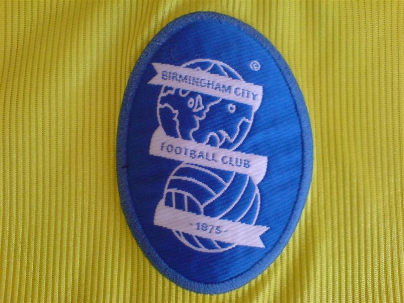
You’ve got to hand it to the St Andrews club - they had international ambitions, but they came to nought. Their current badge, implemented in 1976, features a ribbon and a globe atop an old-fashioned football the like of which one associates with Bobby Charlton and 6-3 defeats to the Hungarians. Original, distinctive, but starting to look a bit tired now. Let’s see what we can change it for...

How about a football featuring a stylised swirly-whirly pattern in blue designed to look vaguely like Spaghetti Junction, the famous motorway interchange resident in England’s second city since the mid-1960’s? Below it in a suitably serifed font could be the name of the club and either side of the ball could be ‘18’ and ‘75’ to show the year in which the club was formed. A modern logo-style badge, admittedly, but one that would see it through another decade or two before the inevitable next redesign.

Norwich City

English club badges featuring birds of one sort or another come ten-a-penny, but not many feature a sweet domestic caged bird constantly fearing its inevitable destiny in the jaws of the humble family cat. Yet that very creature, bright yellow upon a green shield and perched on a ball, has survived well since its inception as part of Norwich’s club badge in 1972. The canary. that is - not the cat.

The problem is, it’s a bit boring, frankly. Canaries by their very nature have little to offer beyond tweeting incessantly until someone tells them to shut up. (Any comparison with Stephen Fry, incidentally, is entirely inappropriate.) Far better, perhaps to have the magnificent spire of Norwich Cathedral on display within a similar shield, flanked on either side by lions (given that there’s one on the Norwich coat of arms). The finishing touch?  The name of the club written in full below it in a modern, bold, sans-serif font. Piece of cake.

Blackburn Rovers

Ah, that trusty old red rose. How very redolent of natural beauty, how very English, how very... badly drawn. Time to get rid of it, methinks. I mean how you can you have a team known far and wide for wearing white and blue halved shirts and not have that incorporated into the badge, for heaven’s sake?

Here’s how you do it. First, you take a circle, slightly stretched top to bottom to make it an oval of sorts. Across the bottom, you have some black wavy lines to depict the ‘burn’ bit of ‘Blackburn’ (it means ‘river’, you know). Above it, the oval is split in two vertically so that the left half is white, the other is blue. In the white half, you have a picture of a mill to reflect Blackburn’s heritage as a wool-weaving town, and on the other you have a sheep - the provide of the wool. As ever, the name can go below somewhere, preferably in a font such as Times New Roman. Heritage, colours and relative imagery, all present and correct.

So there you have it - my own masterclass in how to freshen up those tired old club badges. Nothing could be simpler, and if you wish to prove that by suggesting redesigns of other club badges, drop us a line to admin [at] thefootballattic [dot] com or leave us a comment on this post. We look forward to hearing from you.
You have read this article Badges / Birmingham City / Blackburn Rovers / Norwich City / Southampton with the title Badges. You can bookmark this page URL https://couplesfootballstadium.blogspot.com/2012/10/rebadge-badge.html. Thanks!
Saturday, September 1, 2012

The Esso Collection of Football Club Badges, 1972

Football club badges somehow seemed to matter more in previous decades. Pick up any book or magazine and they were everywhere, as if it was your duty as a young child to memorise and appreciate the graphic identity of every team. This was never more apparent than in The Esso Collection of Football Club Badges from 1972.

Esso had already achieved incredible success with the now-famous England World Cup Coin Collection of 1970 but were keen to reinforce their position as the favoured petrol supplier for English fans everywhere.


As part of their ongoing connection with the world of football, Esso came up with a scheme whereby drivers could claim a free foil badge featuring any one of 76 clubs from England, Scotland, Wales and Northern Ireland with every four gallons of petrol. There was a special board on which to mount your badges, and if you were in a hurry to complete your collection, there was also a starter pack of 20 badges available, reasonably priced at just 20p.

Once again, Esso had hit upon the winning idea that's at the heart of any football-related collection, namely to lure customers into spending as much money as possible in order to complete a highly desirable set. And desirable it most certainly was. Like the England World Cup Coin Collection, the allure was to be found squarely in the shiny qualities that lay within. In fact you could say that Esso were way ahead of Panini on the shiny badge front and were the first to realise that a humble club insignia could be livened up with the application of a metallic sheen.

Curiously, this collection didn't feature all 92 badges for each of the English Football League clubs. Whether that was because of copyright issues, or whether some clubs just weren't deemed important enough we'll never know, but it was certainly admirable of Esso to include clubs such as Glentoran and Cowdenbeath to add an extra degree of interest.

As you'd expect, many of the badges featured look somewhat different to the way we know them today. Some, such as those for Crystal Palace, QPR, Bolton and Hibernian are barely recognisable, but that's in a good way, not bad. It's incredibly important that such changes in graphical design are remembered for the ages, no matter how basic or quirky they may look, and this Esso collection does that in spades.

For anyone interested in having their own Esso Collection of Football Club Badges, there's good news. Many are still available to buy on eBay for a very inexpensive price and you'd do well to grab one. They're a fabulous addition to anyone's Football Attic.


You have read this article 1972 / Badges / Esso with the title Badges. You can bookmark this page URL https://couplesfootballstadium.blogspot.com/2012/09/the-esso-collection-of-football-club.html. Thanks!
Friday, July 20, 2012

Bartholomew Football History Map of England & Wales, 1971

As football memorabilia goes, it's not often you stumble upon something as functional as a map, but back in 1971 John Bartholomew & Son filled that particular gap in the market to great effect.

If you were lucky enough to be both a serious football fan and a car owner in the early 1970's, you'd have probably spent many a Friday evening poring over a huge map like this to work out how to get to the away ground of your choice. All well and good, except an ordinary map didn't really add anything to the match-day experience by virtue of it being… well… just a map.

Bartholomew's, however, saw the potential to add a much needed splash of colour and excitement to the proceedings. With this foldable 100 x 80 centimetre sheet, it was possible not only to plan your route by road but also become acquainted with much of the vibrant imagery the game provides.

The Midlands and the North-West
The bulk of the map was taken up by the outline of England and Wales filled with the markings of a million and one highways and motorways. Overlaid onto that were simple, angular illustrations of all 92 Football League clubs in kit form, joined by lines and dots to the exact location of their home stadium. This was a fine way to underline the footballing subject matter, however to be reluctantly honest for a moment, they did rather obscure the map itself.

Maybe the map was never intended to be used in anger anyway, such was the tiny detail that was printed upon it. This was borne out by the inclusion of this map's finest feature in my view – a top to bottom column showing the club crests of not only the league clubs of England and Wales but also many non-league clubs too.

Brighton and Hove Albion go for
the 'double badge' approach
Here we get a rare glimpse at so many of the graphic devices used by teams some forty years ago or more. It's easy to think that many of the club badges we see today have been around seemingly forever, but this map gloriously dispels that theory once and for all.

A casual glance throughout this parade of 160 miniature works of art reveals some forgotten classics. For a start, there's Aston Villa – a club not unused to changing their badge in recent years – here represented by a squat yellow shield filled almost completely with a lion of the same colour. Then there's Birmingham City, another team using the shield motif, but this time quartered in a bizarre zig-zag fashion prior to the introduction of the double-globe we know today.

Norwich City: Come on you Reds?
You may not be a fan of Bolton Wanderers' 'balloon' badge of the present day, but once upon a time there's was a round-ended shield coloured in red, yellow and blue – hard to imagine nowadays. Crystal Palace's badge, however, seems to have fallen through the cracks of time. Rarely seen, this is a beautifully designed shield labelled with the letters 'CP' while on top sits a simple depiction of the Crystal Palace building.

Another team suffering from colour crisis is Norwich City. Their badge (featuring heraldic lion and fortress) was mainly red and yellow. Back in 1971, they wore yellow shirts and black shorts with only the merest hint of green around the collar and cuffs. Having changed to yellow and green shortly after, it was perhaps obvious that the Canary motif would eventually replace the badge shown here.

Crests, shields and historical imagery were very much the order of the day back then, but perhaps the final word should go to the teams desperate to strive towards a more modern logo. Step forward Skelmersdale United, owners of a beautifully simple badge for its day, and Telford United, happy to adopt a basic compass point arrowing towards a football for its own graphical purposes.

With the tokenistic addition of a potted history of Football in England and Wales at the bottom, you have the perfect example of nostalgic design over function: in essence, a map that can't easily be used as a map. Hang it on your wall, however, and you've got yourself an absolute masterpiece.

To save a bigger version of all the badges shown, left-click on the image above right, then right-click and choose 'Save image as...' to store the full-size graphic on your computer.
You have read this article 1971 / Badges / Kits / Map with the title Badges. You can bookmark this page URL https://couplesfootballstadium.blogspot.com/2012/07/bartholomew-football-history-map-of.html. Thanks!